Check back often

Have you checked out all my blogs?


Dollhouse Minis: http://joannesminis.blogspot.com


18” Dolls: http://joannes18dolls.blogspot.com/


General Crafts: http://joannes-place.blogspot.com/


Cooking: http://joanne-kitchen.blogspot.com/


Also if for some reason I can't post I will try to give a head's up on the Facebook page so check there too.

Showing posts with label dollhouse tutorial. Show all posts

Wednesday, December 25, 2024

Polymer Clay Test: White Clay


Watch the video here.


Last week I showed you the translucent clay that I had added onto my recent Michael’s order. I got this block of white Craftsmart clay in the same order. I was in need of some white clay and I was curious when I saw this because the price was lower than the same size block of Original Sculpey. I think I paid around $13 for this 1 pound block of clay. If I like it that is a really good price.


What I am expecting before I open it is for it to be soft and similar to the Original Sculpey clay.


Upon opening I did find it to be a bit softer than the Sculpey but not by a long way. By the time both were completely conditioned they had a very similar texture. I did not like that the Craftsmart brand left white residue on my fingers though.


The other brand of white clay I have on hand is part of a block of Original
by Sculpey. It is much firmer than the Original Sculpey and more suited to doing things where I want to have fine details.


To set up the test I grabbed my clay roller, clay blade, some sets homemade spacers for rolling the clay, a small round cutter, my chalks with their brush, and a new paper plate. I marked the paper plate into 3 areas for the 3 brands of clay.


Once I was set up (and had the oven heating) I conditioned a ball of each of the 3 clays.


I proceeded to work with each clay. I rolled out the clay using my single layer guides and cut 2 circles. That way I could leave one white and add some chalk to the other one. I also used my double layer guides to roll out thicker slabs of clay and cut 1 circle of each clay from the double thick piece of clay.


I am looking at several things in this test. First off I am looking at the unbaked texture of the clay. How easy are they to condition? I am looking at how smoothly they each roll out, do I get excessive finger prints on any of them? Once baked, what color is the clay? Is it a nice bright white or is it an off-white? Did the clay remain the same size? I have been working with polymer clay for over 30 years and I have never seen one that shrinks but, as my dad always said there’s a first time for everything so I am looking at that. I added chalk to one of the circles of each brand to see if there was a lot of difference in how well the chalk stayed in place once baked.


I did check the package instructions for temperature and baking time. The Craftsmart has exactly the same directions/temperature as the Scupley products.


I baked the samples at 250°F, (the packages all called for 275°but my oven has a bad habit of going higher than I set it) for 15 minutes.


I then allowed the clay to come back to room temperature.


The first thing I noticed was how nice and white the Craftsmart clay came out. It looks great. All the clays baked up nice and smooth.


As for the chalk test there was conditioned the Craftsmart did wipe of slightly easier than the other brands. The Premo held the chalk the best of the three.


Here are some close up photos of all three clays so you can see for yourself how they came out.


So my thoughts overall, I am much happier with the clay than I really thought I would be. It came out very white, it is easy to work with. It is very soft fresh from the package, even softer than the Original Sculpey but once conditioned I think it seems to be nicer to work with, other than that bit of residue that it left on my fingers.


So if you are looking for a less expensive white clay I would say check this one out. It won’t work for everything and I doubt it will be suitable when I want to make a project that has fine details since you really need a firmer clay for detail work. But for those projects that don’t have the really fine details and if you want to give your hands a rest and just have some fun with the clay I like this stuff.


As always I do want to sincerely thank all of you for watching my videos and reading my blog posts. It means so much to me that you are supporting me in this way. If I could ask you all to do just a bit more by subscribing to the channel and liking the videos and leaving comments. Those help more than you can imagine. Also if you could pass the links on to your friends I would appreciate it so much.

Sunday, December 22, 2024

Dollhouse Miniature Christmas Gnomess


Watch the video here.


I have another free pattern for you to download so you make the project. You can find the file here. In the download there are 3 files: a PDF for hand-cutting of the pieces, a PNG to use with your electronic cutting machine and a text file with handy hints and tips (and the sizing information) to use the PNG.


As with most of these projects I cut all the pieces from medium weight white card-stock, the kind used to make cards and such. This is way more economical than having to purchase a bunch of colors and in my experience the paint colors are a lot more stable than the paper colors. I rarely get noticeable fading with the painted projects.


You are free to use the pattern as many times as you wish and even to sell the finished project. But, please don’t give away or sell my patterns. I spend a lot of time creating them and the only compensation I get is from people watching the videos and checking out the blog post. I really want to keep offering these for free so please if someone else wants to make one send them to the video and blog so they can get their own copy of the pattern.


Glue the pieces together as shown on the video using your favorite white glue. I like to use Tacky glue and I use a toothpick as a glue applicator.


Once the glue is completely dry I laid down a strip of masking tape (sticky side up) to hold all the pieces that needed to be painted. To make that easier I group the pieces by the color that I am painting them. I did the same thing with the 3 single layer cookie pieces but I used a piece of washi tape since it is slightly less sticky and won’t tear the single layer of card stock as easily.


I painted the back and hat with red. Then once dry I added a slightly lighter color of red to the hat to give it a bit of dimension.


The plate for the cookies with metallic green.


The braids with a golden yellow color.


 The hands and nose with a flesh like tone.


The had band with white.


The shoes with black.


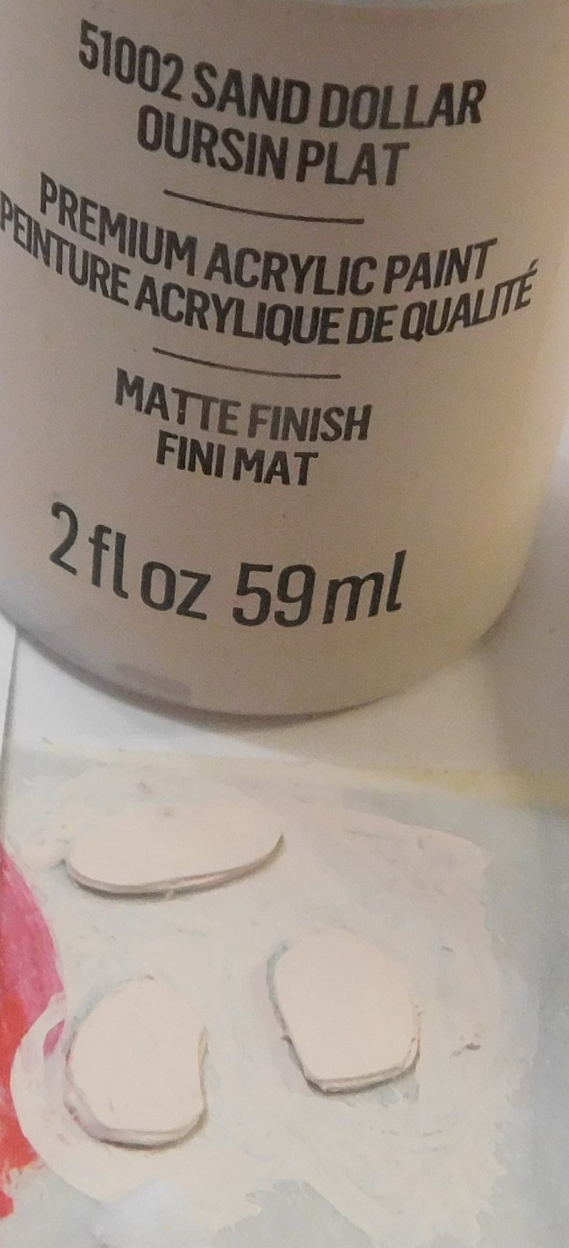
And the cookies with a cream color. And once dry I added some “chocolate chips” with dots of a brown paint.

The cookies are simply a ¼” round and if you want a different shape cookie you could use any shape ¼” hole punch to make them.


Once the paint dries completely it is time to assemble the gnomess. This will be done in stages allowing the glue to dry at least a bit in between so everything stays in place as you add parts.


I like to start by gluing the hat to the hair and the nose as the first step. Then this can set up. Since she is holding the plate of cookies I also glued the cookies to the plate so they could also dry.


Next the hat portion can be glued to the body/backing piece. I wish I had glued my hat on lower to the body but I was feeling really rushed as I was working on the gluing since the building I live in is in the middle of having all the balconies removed and new ones put on. Just as my paint was dry they showed up to do the removal and it was very noisy for the rest of the day.


After the hat part add the shoes, the plate of cookies and the hands. Then allow the glue to dry completely.


Now we just need to add a thin even coat of a clear finish. I am using Satin Mod Podge on mine. I did coat the back off camera (including the edges all the way around) then when that dried I came back and coated the front on camera going over the edges a second time. I find doing 2 coats on the edges really helps to seal all those layers and makes the finished gnome look a lot nicer. Allow to dry.


As always I do want to sincerely thank all of you for watching my videos and reading my blog posts. It means so much to me that you are supporting me in this way. If I could ask you all to do just a bit more by subscribing to the channel and liking the videos and leaving comments. Those help more than you can imagine. Also if you could pass the links on to your friends I would appreciate it so much.


Wednesday, September 25, 2024

Dollhouse Miniature Paint Test More New Paints


Watch the video here.


I was checking out the Christmas craft aisle at my local Dollar Tree and found another box of holiday colored paints from Delta Ceramcoat on the shelf. I was actually looking for them this time after randomly finding the fall ones a couple of weeks ago. This time I got to the box before anyone else because the box was full! I found 6 colors of paint (3 metallic and 3 glitter) so I assume I missed a glitter color in the fall ones. I knew I had to grab one of each color and share them with all of you.


The glitter paint colors are:


Starry Silver: this is a really pretty silver glitter paint that blotted on like I did with the swatch is very pretty and sparkly. Do note that I only did the one coat I on the glitter colors. So if you blot on these paints fairly heavy they look great. This glitter is nice because all the sparkles are silver with not other colors included.


Gold Crown: again remember this is just 1 coat of the paint blotted on the area. This is a nice neutral gold color glitter again with just the gold sparkles included. Depending the base color you put this over you could get some fabulous affects.


Sparkling Red: this is a cooler red (just a bit on the blue side of the color range but still a red) and again just the red sparkles. Very pretty color.


The Metallic colors are:


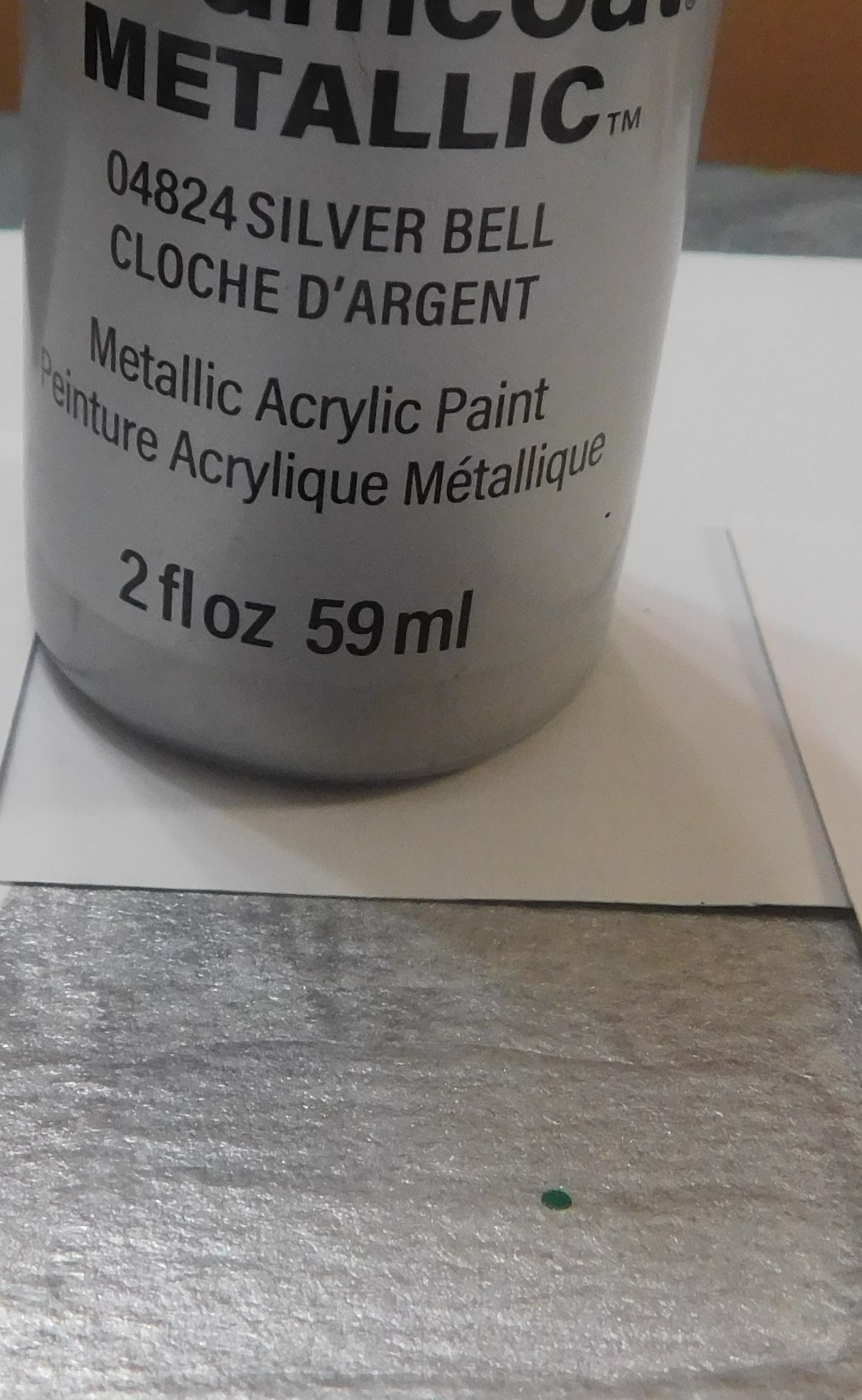
Silver Bell: this silver has a slight cool (bluish) tone to it. Even the first coat of the color covered pretty well. I only did 2 coats on all the swatches this time. So for a metallic color this one has fantastic coverage.


Festive Gold: this is a warmer gold coming in as a close match for my golden yellow color I use a lot as an undercoat for gold paints. It is very different in tone from any of my other gold paint colors and could also be used if a brass finish was desired with a proper undercoat of a warm color. This was the most translucent of the 3 metallic colors I tested today.


Holiday Green: this is a cooler green and very pretty. As far as the opaqueness this one was in the middle of the 3 I tested today.


I am keeping my fingers crossed that Dollar Tree continues to carry these types of paints for the different holidays going forward. I will be keeping my eyes on the holiday craft aisles in the future.


As always I do want to sincerely thank all of you for watching my videos and reading my blog posts. It means so much to me that you are supporting me in this way. If I could ask you all to do just a bit more by subscribing to the channel and liking the videos and leaving comments. Those help more than you can imagine. Also if you could pass the links on to your friends I would appreciate it so much.

Wednesday, September 11, 2024

Dollhouse Miniature Paint Test New Paints


Watch the video here.


I was walking through the Dollar Tree and checking out the new things that were out for fall and Halloween. I happened to notice a box shoved in a corner of a lower shelf that was almost empty that contained bottles of acrylic paints. The firs thing I noticed was the bottles did not look like the normal ones I see at Dollar Tree on the craft aisle. And indeed, these were Delta brand Ceramcoat paints!! I immediately grabbed the box and dug through the few bottles in it. I was able to come away with 5 bottles of brand name paints in what appear to be special Halloween colors. All for $1.25 each. I was very happy indeed and had to share them with all of you as soon as possible.


I did try to find the paints on the Dollar Tree app to see if there were more colors available but they don’t even show up on the app so I have no idea if there should be more than the 5 I got or not. I will be checking for more on each trip to the store for sure though.


Since I wanted to see what these look like I decided to do a paint test/swatch of them and share that with all of you too. I am really excited about these color and I am especially excited to get to use at least 2 of the colors soon.


To do the swatches I made a “swatch card” from some of the 140lb watercolor paper that I have been using for my paint test swatches. This time I had a piece in my scrap bin on my table and used it. It measures about 6” by 6” and I drew a grid of 2” square boxes to test the paints in. I felt the 2” size would give me plenty of room to test the paints and add the color names. And also I have plenty of room if I want to test other colors on the same card in the future.


Here is what each color looked like, all the swatches have 3 coats in the finished swatch.


Lime Green Metallic- like all metallic paints (at least in my experience) this one is very translucent. Even with the 3 coats it is still not as opaque as I would like so when I use this color I will need to remember to add an undercoat of a more opaque color. The metallic sheen is nice on this color but not super shiny.


Black Metallic- this color is the most opaque of the all the colors I swatched today and I can see me using this on lots of projects in the future. Anywhere I want the look of a black metal this will be my go-to color. Three coats of this color gave really good coverage.


Dark Purple Metallic-as far as opacity this one is the middle of the 3 tested today. I love this color and I am sure I will get a lot of use out this one as well.


Orange Glitter- as I expected this paint is orange glitter suspended in a clear paint base. For a complete coverage using a make-up sponge to apply it will probably give the best results. Otherwise for a light glitter haze a regular brush would be fine. All the glitter flecks are orange in color in this.


Violet Glitter- pretty much the same as the orange with just a change of glitter color. The glitter flecks are mostly dark purple with some pinkish ones sprinkled in. overall a very pretty color.


So are these worth the price? I think so especially the metallic ones, I can see using those in many projects year round particularly the black one and to a slightly lesser degree the purple one. The green will probably not get as much use but still fun to have. The glitter ones, I’m not sure how much or where I will use them but they are fun and I am sure they will turn up in projects from time to time.


As always I do want to sincerely thank all of you for watching my videos and reading my blog posts. It means so much to me that you are supporting me in this way. If I could ask you all to do just a bit more by subscribing to the channel and liking the videos and leaving comments. Those help more than you can imagine. Also if you could pass the links on to your friends I would appreciate it so much.


Sunday, September 8, 2024

Dollhouse Miniature Pumpkin Makeover


Watch the video here.


As I was walking through the Dollar Tree the other day I saw these pumpkins hanging on the wall. They caught my eye because of the size, they looked to be perfect for the dollhouse. The color however was way too bright to look like anything close to a real pumpkin. I knew I had to try to tone down that color and use some to decorate the dollhouse porch for the season though.


The first step was to remove the wire from the bottom of the pumpkins and replace it with a toothpick to use as a handle while painting. I have my little wooden blocks to put mine in but you could also use a foam block or a chunk of pool noodle to hold yours.


For the first coat of paint I used Anita’s in Terracotta, this is a very muted orange and will tone down the bright orange and work well as a base coat under the painting technique I am going to use today.
Don’t worry about this coat of paint being perfect, if a little of the bright orange peeks through that’s okay it will just add to the depth of color later.


I also base painted the stems with a very pale yellow paint. This will lighten them and allow the painting technique to work nicely to create the look of a dried stem on our pumpkins later.


Allow these paints to dry completely.


Now we are going to dirty up the pumpkins and accent the indentations on them. For this brush on a medium brown, I’m using some Woodsy Smoke from Anita’s. Then use a makeup sponge to blend the edges of the paint really well. I used a really small brush for this step to get the paint just in the crease part initially. When blending try to get rid of any sharp lines at the edges of the brown paint. Then allow this paint to dry completely.


Now we are going to give the pumpkin it’s color. For this I am using 3 colors of paint- the same Terracotta that we used earlier, Buttered Yam also from Anita’s, and some Vivid Orange from Folkart. You don’t need to use the exact same colors just some that are similar to these. Add a drop of each to a flat surface.


Then using a tiny brush add dots of the paints to the parts of the pumpkin that stick out from the indentations. I kept most of the Buttered Yam at the top of the area, the Terracotta at the bottom, and the
Vivid Orange at the middle. Then using a clean makeup sponge (the wide end) blend the colors to look like the photo. Allow to dry completely, since the paint is so thin this won’t take long.


Now we are going to tackle the stems and make them look like they are in various stages of drying out. Again we are using 3 colors of paint- the same brown we used earlier to “dirty up” the pumpkins, the same pale yellow we base coated the stems with, and Leaf Green from Ceramcoat. 


Again add a drop of each color to a flat surface and use a tiny brush to add tiny dots to the stem then using the skinny end of the makeup sponge blend the colors on the stem just like before. Try not to get these colors onto the pumpkin. When you have the look you like allow to dry completely.


Remove the toothpicks carefully and display your pumpkins around the dollhouse or in your fall mini scene.


As always I do want to sincerely thank all of you for watching my videos and reading my blog posts. It means so much to me that you are supporting me in this way. If I could ask you all to do just a bit more by subscribing to the channel and liking the videos and leaving comments. Those help more than you can imagine. Also if you could pass the links on to your friends I would appreciate it so much.


Wednesday, September 4, 2024

Dollhouse Miniature Neon Sign (non-working)


Watch the video here.


Today we are making a fake neon sign for the dollhouse or a miniature business. I was looking through a very old notebook I have that I wrote all kinds of projects in way back when I was first starting to do minis. This was at least 30 or so years ago. Back then I would go the library and check out any books or magazines they had on miniatures and take them home and read everything cover to cover. Took a lot of notes about projects I thought I might want to try to do someday when I had an idea of how to do them. This project was one of those.


When I read it the other day I was instantly intrigued this seemed too simple to work. But I am happy to report I think this could be a really fun thing to do to create some artwork for a more modern dollhouse room. I will say I would be very careful about where this is displayed since hot glue does have a tendency of melting again if it gets too hot. So keep this one out of direct sunlight. I think it will be fine in a normal room-box just don’t place it right in front of a window where the heat could melt it.


The first step in this project is to decide what your neon sign will look like. I went the easy route and just wrote the word “open” since my brain was not really in creative mode yet. I drew two parallel lines to give me the height of my letters and wrote my word all in pencil. I made my letters very blocky and simple. Then once I was happy with what it looked like I traced just the word with a black marker. This way I would be able to see it to trace over it later. I taped this to my work tile. This is my pattern.


Now I taped a small sheet of parchment paper (the stuff from the kitchen) over the top of the pattern. The tape won’t really hold it but it will help a bit. You need to work on a surface that is both nonstick and translucent so you can see your pattern.


Make sure you glue-gun is really heated up. I found with the one I have it needed to preheat for at least 10 or 15 minutes to get the glue to flow nicely on the lines. When I tried it sooner it was very lumpy and looked really bad. You want the glue to be dripping really well from the tip of the glue-gun. One the glue is hot it is just a matter of tracing the lines on the pattern. Keep in mind you might need to do multiple layers of glue to get a good looking line. Just take you time and go slowly. Once you have traced over all the lines on pattern make sure the glue between areas is touching. In my case I needed to make sure all my letters joined together. If there is space between them just add a small dot of glue to act as a “bridge” so that you will have one piece when you are done. Now let this cool and set up but leave you glue-gun plugged in so it stays hot.


Once the glue has hardened check to see if you have spots that are too thin or that you missed and add more glue as needed. You can do this as many times as you feel you need to until the sign looks the way you want it to look. Once you are happy let it cool all the way to room temp and you can unplug the hot glue-gun.


Now you can peel the sign off the parchment and take another look at it. If it needs to have more glue added this is the time. Go ahead and add glue to any spots you feel need it. Allow to cool again.


Once cooled use a small pair of scissors and trim the sign to remove any spots that don’t belong and also those hairy bits that hot glue always leaves.


Once you are completely happy it is time to add the color to the sign. I am using some alcohol markers made by Bic, you could use any brand of alcohol marker for this.


Turn the sign over and carefully fill in the back of the design with the marker. Skip any “bridge” areas you added to hold the sign together. I find it takes about 3 coats of ink to get a really good color. I also found letting the ind sit for a couple of minutes between coats allowed it to stay on better. I think (but I’m not sure) that what is happening is the ink is soaking into the glue.


Once the color is the way you want it you can either mount the sign on a board like I did. Or on the wall of your miniature scene.


I had planned to mount mine on black but I liked how the colors looked against the white better so that was what I went with.


For my board I cut a piece of foam-core slightly bigger than my sign, glued a piece of white paper on the front. Then I framed it with some black card-stock.


I ended up using tacky glue to attach the sign to the board.


Now for the almost disaster I had. I was originally going to use some super glue to attach the sign. And for most of the sign it was fine. But the spots where I put the dots of super glue on the area of the sign that was the green color instantly turned brown. I guess the super glue was reacting with the whatever that color ink was dyed with. The other 3 colors I used were fine just the green reacted. I was able to work very quickly and using a sewing pin I picked off the glue from the sign in those areas and then added more ink over the spots.


The sign I did on camera was the third time I traced the letters and I see a great improvement from the first one I did to the last one. With some more practice I think I could get some pretty intricate designs with this method and that could be a lot of fun.


As always I do want to sincerely thank all of you for watching my videos and reading my blog posts. It means so much to me that you are supporting me in this way. If I could ask you all to do just a bit more by subscribing to the channel and liking the videos and leaving comments. Those help more than you can imagine. Also if you could pass the links on to your friends I would appreciate it so much.